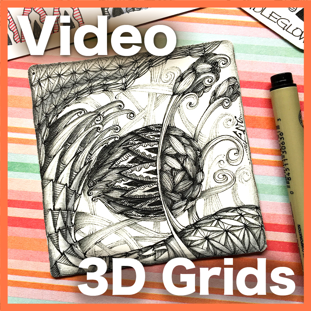
3D Grids lesson now back again
The end of the year is approaching and with it my self imposed deadline to pass all my lessons to the new platform on teachable is looming close. I think I can, I think I can! This one is a much requested lesson on how to distort and 3-dimensionalize grids so that they look very dimensional when filled in with fragments and tangles.
The lesson starts with the basics, showing how to work with a simple grid to create a 3D effect. This is not simply a matter of shading, it's also about distorting the grid to make it look like it has depth.
Aside from the distortion you see here — Puffing it out — the lesson also covers other strategies to work with grids.
After practicing on some basics, the lesson shows how to develop this beautiful botanical-inspired project, which covers a few different types strategies on how to make grids look 3D.
The project is covered from beginning to end, so you can follow along and create a similar picture, or you can use the strategies described to create your own project.
As usual, no stone is left unturned, and the project even covers detailed shading techniques — including “atmospheric shading”, a technique that can help to push background elements into the drawing and away from the foreground.
What I particularly like about this project is that it not only uses traditional grid patterns but also some fillers such as Garlic Cloves to create 3D elements such as these floral buds.
You can find this lesson now, back again, at my lesson shop.


This color scheme was not my favorite when I finished the piece - what was I thinking! - but it's starting to grow on me. Here is Pickpocket (Tomàs Padros) and also a coiled ribbon pattern similar to Cadent with a lotus in the middle, found on Plate X (Egyptian) of the Grammar of Ornament by Owen Jones, 1865. Ancient Egyptian ornament was mostly very geometric; flowing lines like this were very rare. Tangled with inktense and pitt artist brush pens.