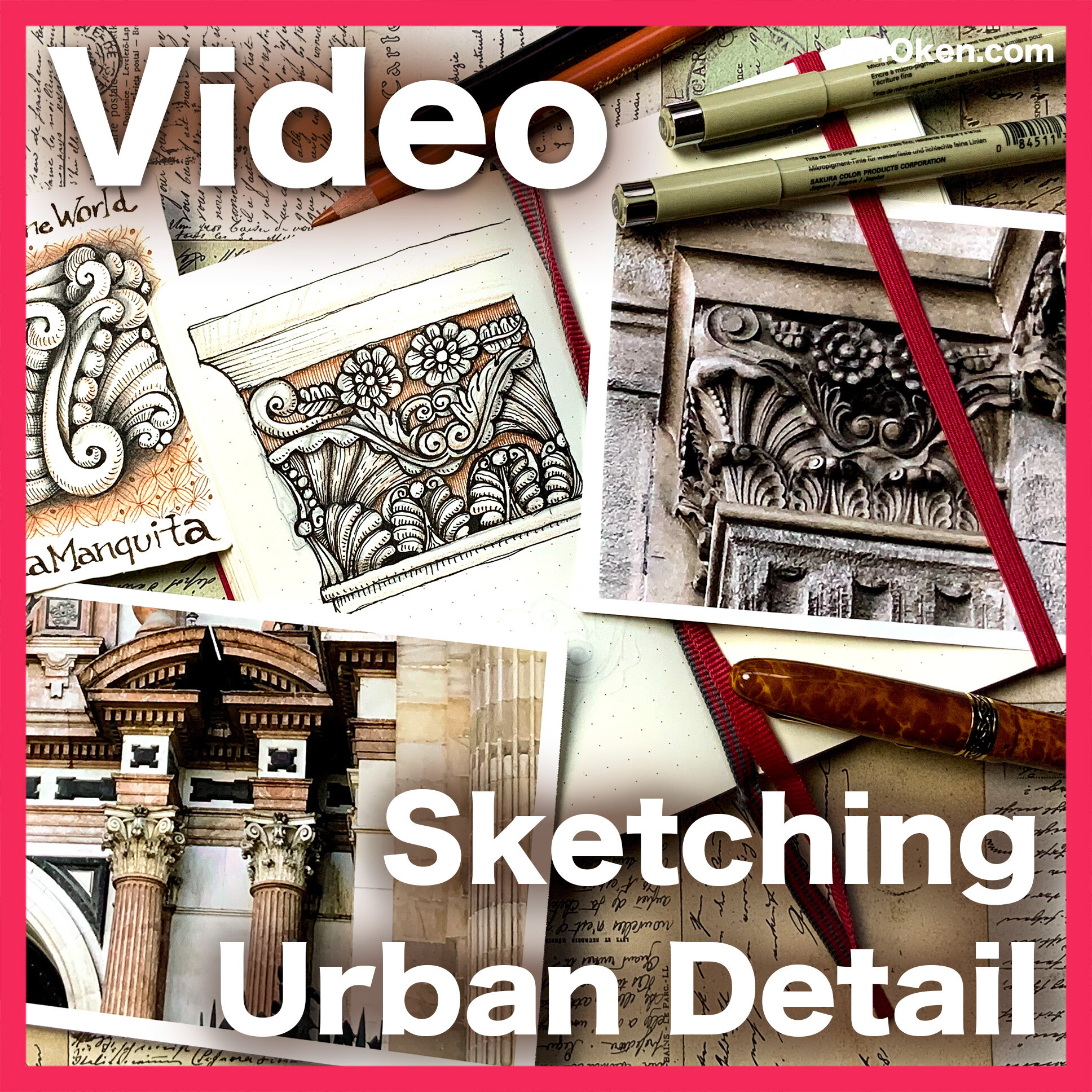
Sketching Urban Detail Santa Monica
While Art Clubbers and I are just starting our journey to explore sketching urban detail based on the latest lesson, we try to find sites that are interesting to draw in our home towns — or if it's impossible to visit in person, photographs do just fine. You think that your own town doesn't have a lot of urban detail, right? Think again, it's only a matter of looking.
In 1999 — just a few years after I had moved to California — I went to downtown Santa Monica with my parents who had come for a visit, and marveled at some of the wonderful buildings in Spanish Colonial Revival, such as the “Santa Monica Professional Building”. Here's what the building looks like today:
You can't see it very well, but the top has these GORGEOUS carved details. According to the LA Conservancy webpage, the ornamentations are of Moorish and baroque influence.
Here are some pictures of the carvings that I took myself with my trusty old Nikon zoom lens, back in 1999. Today it seems that the coloring of the building is different, more black and gray. 20 years ago, they were a light sandy brown with white trim:
I used these close-up photos to find inspiration to capture this fragment:
This is not a completely faithful and accurate representation of course, but then again, the whole idea of this lesson on sketching urban detail is to allow the artist to be INSPIRED by the historic details, and not entirely preoccupied in creating a faithful copy. The more practice you get, the more intricate the results, of course.
This lesson is now EXCLUSIVE to Art Club members, but you can read more information about it here:


One of my favorite things to do while traveling is to extract urban details, and then use those details in a Zentangle Inspired piece. This one is from details extracted from the local church in Charlottetown, Canada during my recent trip.